As part of a regular feature in our quarterly newsletter, we asked LDaCA’s Industry Engagement and Communications lead, Chenoa Pettrup, for a tip to pass on to readers. Read on to find out her tip for turning your data into useful visuals.
If you’re new to data visualisation, don’t feel like you have to rush straight into coding. Take time to plan an approach with these simple practices:
If in doubt, sketch it out.
Before diving into tools, sketch a few layout options—on paper or using digital platforms like Figma. Rough visuals help clarify your thinking and reveal possibilities early. This step is helpful because it allows you to explore different configurations and ways of displaying information before you start coding. It can also help provide a skeleton to work towards once you do start putting your code together. Sketching gives you a clearer sense of direction and enables you to figure out the most effective way to communicate your information.

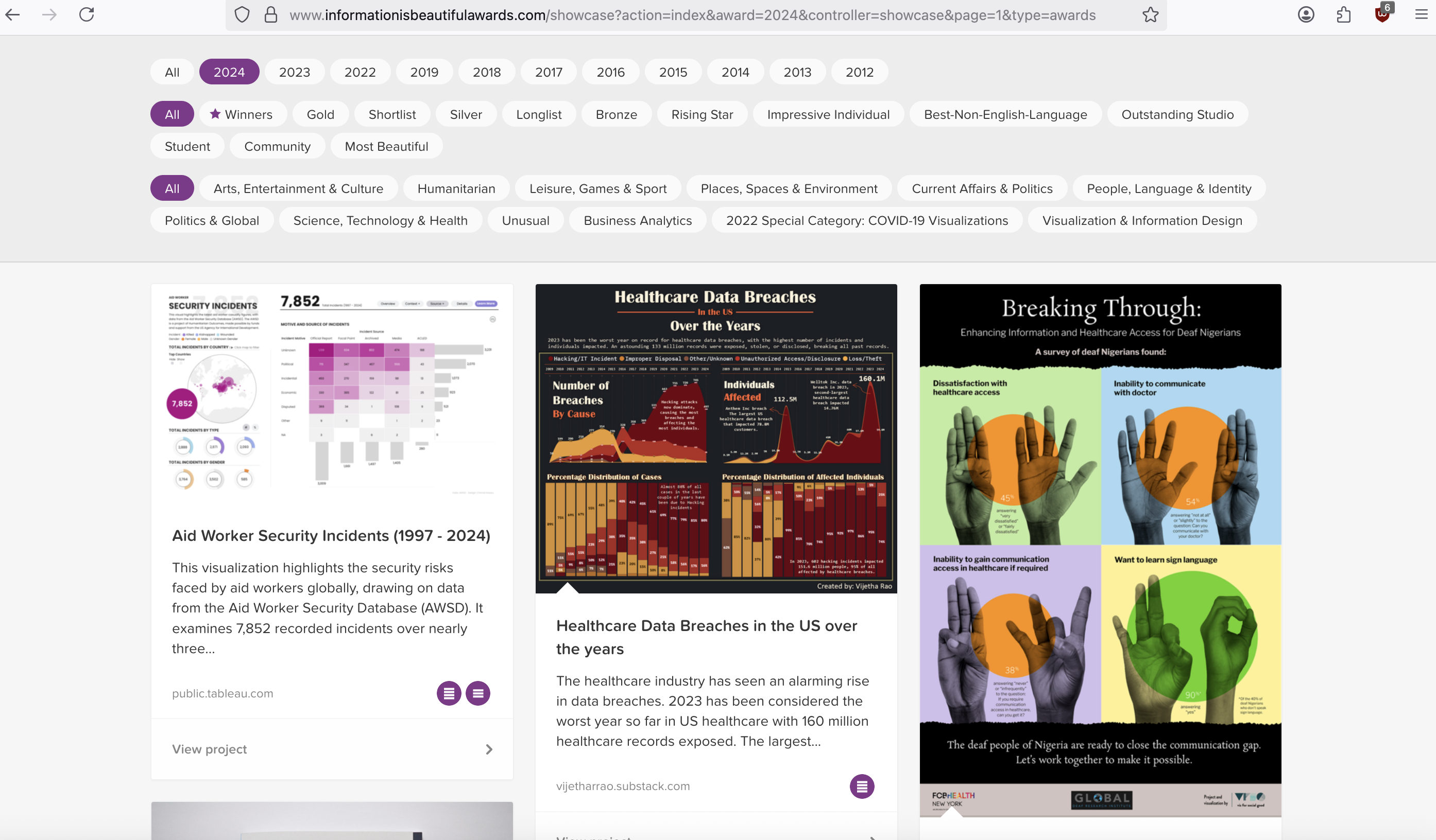
Image Source: Information is Beautiful Website
From tired to inspired.
Go beyond the defaults of pie charts and bar graphs. Explore how others turn data into meaningful visuals. Sites like Information is Beautiful and FlowingData are excellent resources for discovering innovative visualisation methods. The Visual Display of Quantitative Data by Edward Tufte is another great resource for this. Reviewing how others have approached their data can offer fresh perspectives and can spark your creativity. Engaging with such examples can set the stage for powerful storytelling through data.

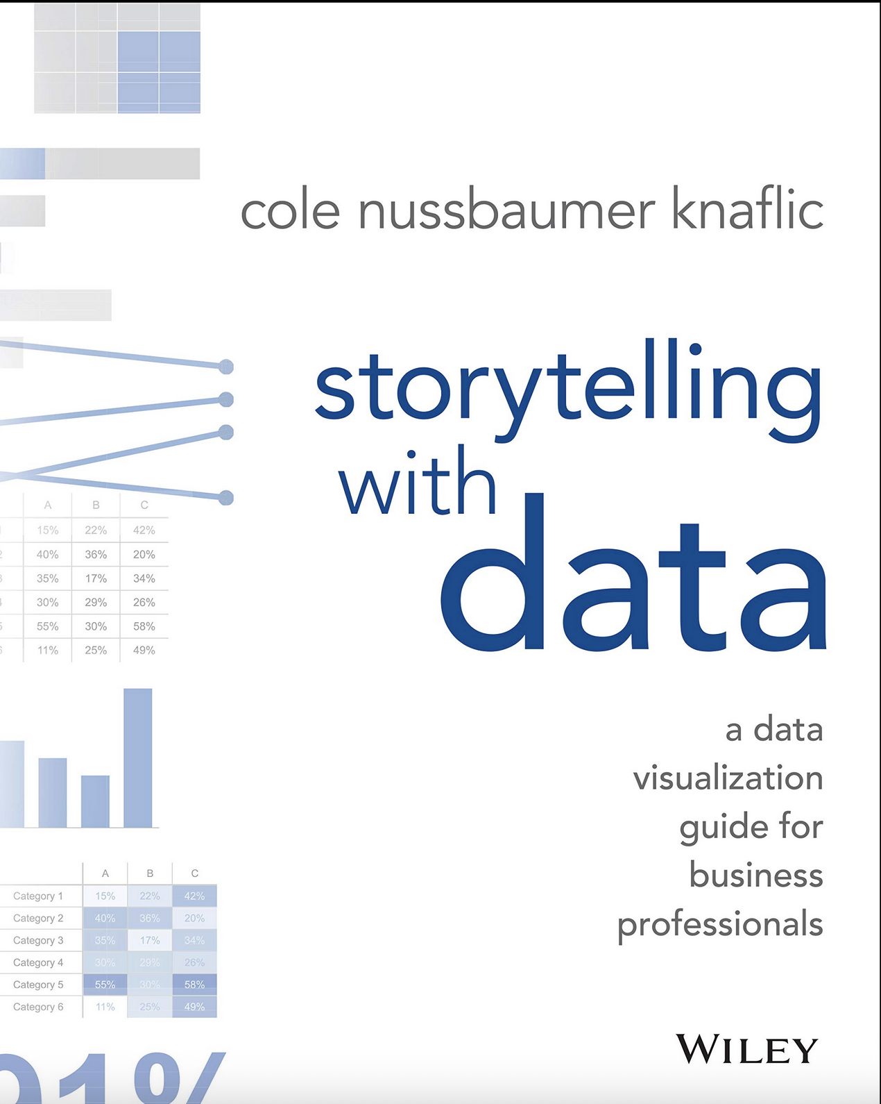
Image Source: Storytelling with data book cover
No guts, no story.
Effective data visualisation is not just about showcasing numbers—it’s about telling a story that makes sense for your subject matter and your audience. Consider how your data can weave a narrative that engages viewers. Visual metaphors, annotation, color and images can help with highlighting information. Telling a good story starts with knowing the information that you want to convey and what is at the centre of your data. Combining the data with narrative can help convey complex information in a way that is relatable.
Storytelling with data by Cole Nussbaumer Knaflic is a great starting point for learning more about how to do effective storytelling with data.

Image Source: Photo by Marc Grimwade, courtesy of ARDC
Chenoa Pettrup
Chenoa Pettrup is the Industry Engagement and Communications Lead for the Language Data Commons of Australia.
She has 10 years’ experience working within the GLAM sector and has applied knowledge of engagement, digital initiatives, and design. She has a passion for making complex ideas accessible and collaborating with a wide range of stakeholders to deliver impactful projects.
